We began TapRecruit (now Datapeople) six years ago as a bootstrapped upstart with big ideas and a sincere belief that opportunity wasn’t always accessible to qualified candidates.
In the time since, we’ve matured into a robust recruiting analytics platform, indexing and organizing vast amounts of performance and language data, on a mission to make the world of recruiting more fair and efficient.
Our rebrand isn’t a departure from our roots. But it is an opportunity to more accurately reflect who we’ve always been: people who care about people data.
A better name
While a name like TapRecruit certainly has an appeal because of its association with recruiting, it also makes it easy for people to mistake you as an outsourced recruiting firm.
The TapRecruit name and logo were quick solutions. We needed a name, we needed a logo, and we needed a brand. But once we had a generally satisfactory option, we got right back to the harder challenges of building language models and organizing recruiting data.
The truth is, bootstrapped companies can be a lot of fun to build, but they force you to seriously consider every dollar you spend. We always chose product investments over marketing.
We’re optimists at heart
In the years since, we’ve passed a few significant milestones. We’ve grown as a team, both in headcount and in thinking, and we now have hundreds of global customers. We’ve also collected and annotated 35,000,000+ unique job posts and outcomes directly from employers.
And while we’ve remained true to our mission of making opportunity more accessible to candidates, we’ve also uncovered another truth about how we, as Datapeople, like to operate.
We’re unshakably optimistic. About our customers, the power of technology to address inequity, and the direction we’re going as a company. We know that no one piece of technology can solve every problem, but we’ve validated that small changes in behavior can have an outsized impact on equity in hiring.
To put it bluntly, this makes us grin from ear to ear. So, when designing our new brand, we wanted our optimism to be visible at all times:
New Logo
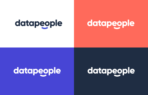
We chose a san serif font and adjusted the edges for a softer feeling. The smile positioned directly under the E and O of Datapeople is a reminder that the heart of our mission is both Equity and Opportunity.

Happy Icons
Yep, more smiles. Regardless of where you encounter our new brand, we want to remind you that we’re very happy data people. The smile included here is the same shape and proportion as on the logo.

Fresh Colors
We wanted our optimism to be visible at all times, and nothing quite captures the energy and opportunity we see in recruiting like a bright, fresh color pallet. Because we organize our language guidance using color, we took great care to ensure that our new color pallet reflected that organization.

We are very grateful Datapeople
We have a new name and a new look. What will never change, though, is our commitment to creating products grounded in analytics and science that will help our customers be better at hiring.
If you’re a data person interested in using data to improve the hiring experience for candidates, we’re hiring! If you’re a people leader interested in using data to make hiring more efficient and fair, we have a fresh new batch of product demos.
